2.2 Histograms, Frequency Polygons, and Time Series Graphs
Chapter Objectives
- Display data graphically and interpret the following graphs: stem-and-leaf plots, line graphs, bar graphs, frequency polygons, time series graphs, histograms, box plots, and dot plots
- Recognize, describe, and calculate the measures of location of data with quartiles and percentiles
- Recognize, describe, and calculate the measures of the center of data with mean, median, and mode
- Recognize, describe, and calculate the measures of the spread of data with variance, standard deviation, and range
Assignment
- All vocabulary (see Key Terms for definitions)
- 2.2 Homework 80–85
- Read the next section in the book
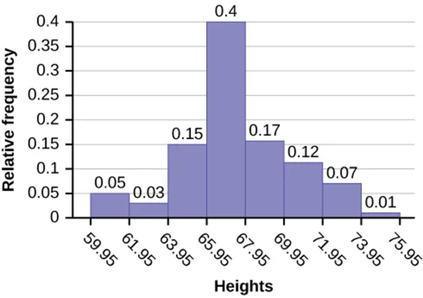
Histograms
- Not a bar graph
- Typically used for continuous data
- Bars are next to each other to highlight the continuity
- Vertical can show frequency or relative frequency (percentage of total data)
Figure 2.2.1 A histogram.
Creating Histograms
Figure 2.2.2 The three histograms above are created using the same data sets, but with different bin widths.
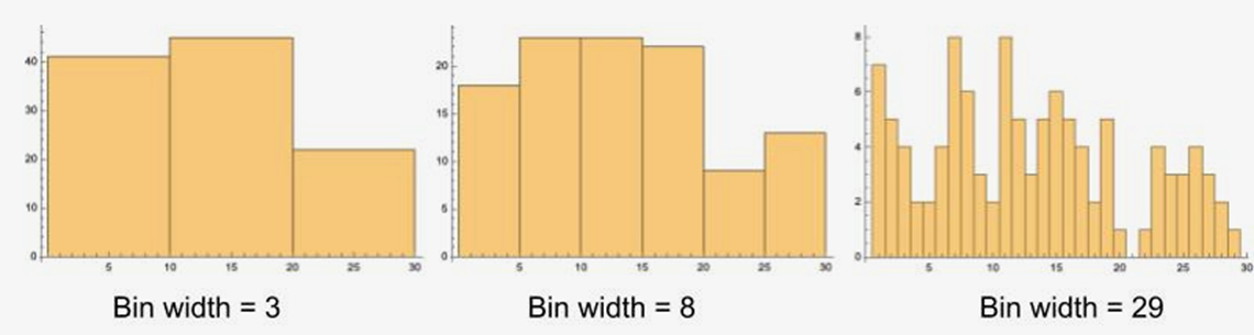
- Number of bins is key
- If not given, square root the number of data points and round up to next integer. Then divide range of data by that integer.
- Round up again, this time to same number of digits as data
- Ex. There are 100 data points. The lowest value is 60.0, highest 74.0. What is the bin width? What if it was 80 with the same range?
- Below are the bin widths for 10 bins
- Square bracket means included
- Parentheses mean up to, but not including
- A value of 61.4 falls in the first bin
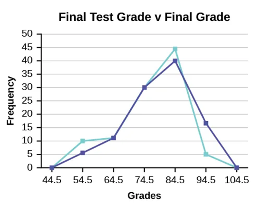
Frequency Polygons
- A histogram pretending to be a line graph
- Same rules from histograms
- Points are at midpoint of bin
- Useful for comparisons since they overlap easily
Figure 2.2.3 A frequency polygon.
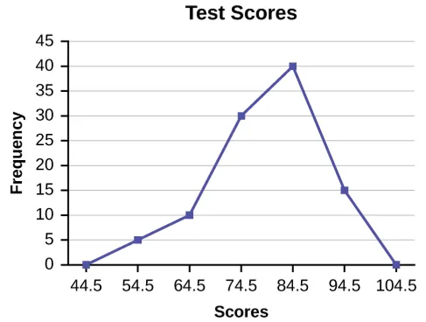
Figure 2.2.4 Two frequency polygons overlapping.
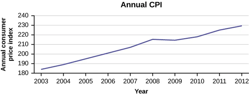
Time Series Graph
- Used for plotting data that changes over time
- Points are in chronological order
Figure 2.2.5 A time series graph.