1.2 Data, Sampling, and Variation in Data and Sampling
Chapter Objectives
- Recognize and differentiate between key terms.
- Apply various types of sampling methods to data collection.
- Create and interpret frequency tables.
Assignment
- All vocabulary (see Key Terms for definitions)
- 1.2 Homework 57–83 odds
- Read the next section in the book
Qualitative Data
- Also known as categorical data
- Describes attributes
- e.g., hair color, blood type, place of birth
- Easy to work since there’s less math involved
Quantitative Data
- Numbers!
- e.g., money, pulse, height
- Discrete quantitative data means only certain numbers, typically whole numbers
- e.g., number of people in a household
- Continuous quantitative data is data where all numbers in a range are valid
- e.g., height, weight, time
- ! Limited accuracy doesn’t imply discrete !
Discrete or Continuous?
- Number of classes in a schedule?
- Square footage of a room?
- Minutes spent at practice?
- Ask if you are counting or measuring.
Displaying Qualitative Data: Tables
Figure 1.2.1 A table comparing part-time and full-time students at two colleges.
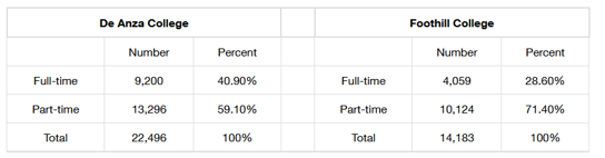
- Helpful for organization
- Poor for understanding
- Including percentages is good for comparing data sets of different sizes
Displaying Qualitative Data: Pie Chart
Figure 1.2.2 A pie chart representing the same data from above.
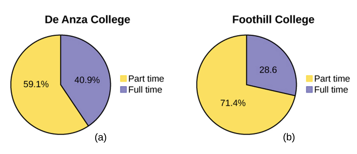
- Wedges represent each category
- Should only be used when percentages add up to 100%
- Best for showing portion of the whole
Displaying Qualitative Data: Bar Graph
Figure 1.2.3 A bar chart, also showing the same data as above.
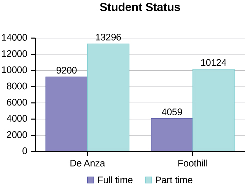
- Good for change over time or comparisons
- Preferable to pie charts if there are many categories
Figure 1-2-4 Ethnicity of students at a college. The large number of categories make it tougher to see comparisons in a pie chart. Ordering from largest to smallest in both improves readability. When bar charts are ordered this way, they are called Pareto charts.
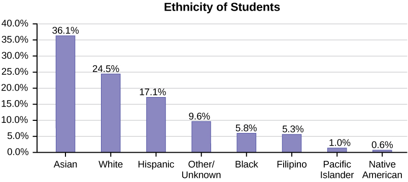
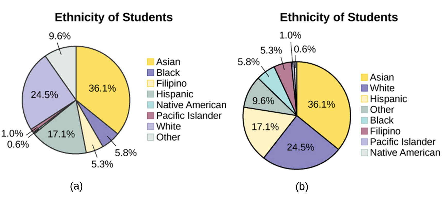
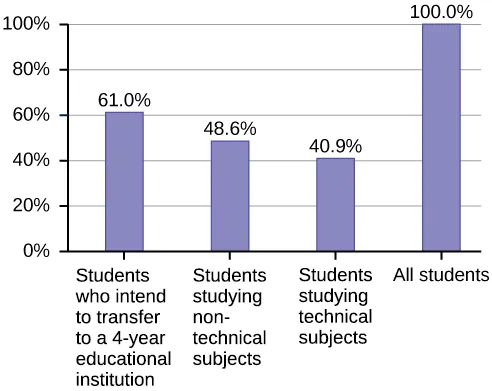
Figure 1.2.5 When subjects overlap categories, percentages add up to over 100%. Including a population bar helps with making it clear that there is overlap.
Two-Way Tables
Figure 1.2.6 A two-way table for men and women’s sports preference.
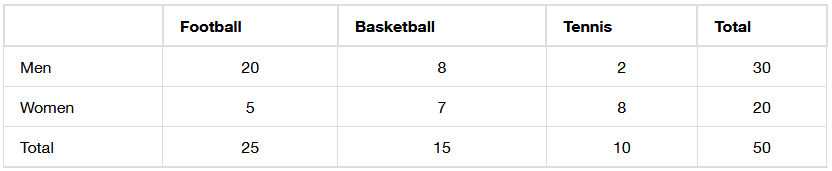
- Two categories means two-way
- Marginal distributions are the totals (on the margins/edges)
- Conditional distribution involve specific subsets
- E.g., men who prefer basketball, which is 8
- Inner vs outer part of the table
- What percentage of men prefer basketball?
- What percentage of basketball fans are men?
- “Of” signifies the total you should be looking at
Sampling
- Population too big? Just get some of them, randomly.
- Simple random: everyone has equal chance of being picked
- Stratified sample: group by a characteristic, then randomly
- Cluster sample: break population into groups that mirror the population, then sample random clusters
- Systemic sample: sample every 𝑛th subject
Convenience sampling: just getting whoever is available- Avoid bias by keeping your population in mind
Critical Evaluation of Your Study
- Problems with samples?
- Self-selected samples?
- Sample size issues?
- Undue influence?
- Non-response?
- Causality?
- Self-funded study?
- Misleading use of data?